This post contains affiliate links. We may earn money or products contained in this post. Please click my disclosure policy to learn more.
How to Paint skin tones in watercolor
Do you struggle with skin tones? Do you find your watercolor skin tones are flat or just not quite right? I know I had that problem for a very long time. However, I found mixing watercolor skin tones wasn’t that hard and a whole new world opened up to me. Painting watercolor portraits is pretty much my favorite thing to paint.
I have done a lot of experimenting and a lot of trail and error. There are so many ways to paint skin-tones. It’r really not too difficult once you get the formula down. Once you know the basics you can begin to experiment and come up with new ways to make the tones and effects you want. Mixing your own skin tones allows you to get greater depth and accuracy for your skin tones.
About skin tones
Skin is never just one color. Even with very white or dark tones. We all have varying shades in our skin. To give your paintings more dimension and depth you want to keep this in mind. We all have different undertones in our skin from yellow to pink. You can also add depth by using creative color choices.
Many people look at a their watercolor palette and choose the color that looks peach or brown and use it for their face. Usually they find it lacks something, that’s because these tones don’t have the right colors to create skin. The human skin has yellows and blues in it and when you mix your colors it shows. There are ties when you can choose the skin tone color of your palette, for example, if you are going for a more cartoon or anime look. Usually, these colors are smooth and only contain a few high;oghts and shadows.
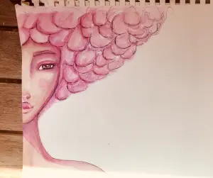
You also don’t have to stay within the peaches and browns of realistic skin color. I love to paint with shads of purple, pink, red and blue giving my skin a whimsical look to it.
The key to making good skin-tones is know the basics, practice, experiment and not being afraid to lay your paint down on your paper. You can do the excesses in this article over and over finding new shades and colors for your paintings.
Preparations
You want to make sure you a good setup. I like to have a clear space to work. It allows your mind to focus painting.
Feel free to practice lots before you try to paint serious paintings. It’s okay to even practice on your good paper. I actually suggest practicing on book cheaper and good paper so you can get a feel of how the paint reacts to both. You’ll be surprised how paper can change how paint reacts and even the color of the paint. You can read more about watercolor paper and paints in this article.
A few watercolor tips
Always have two cups of water. One to clean your brush and the other to load clean water. Having dirty water can taint your paint.
Tape your paper down using easy to remove tape such as masking tape or washi. You can blot your tape in your pants to help remove some of the stickiness so it’s easy to remove and does not damage your paper.
Abandon all fear.
Step 1. Mixing paint realistic skin tones
I’m going to cover mixing light, medium, and dark skin tones. Once you have a grasp on those then you can easily find the shades in between. Skin comes in so many variations it can be very frustrating when tutorials only cover peachy tones. So, lets look at how at the colors you’ll need.
You can make sit-tones with a very limited palette. My go to watercolor set if my Kuretake Gansai Tambi watercolor set. You can read my full review of them here.
Here is a list of everything I used in this tutorial:
Let’s start from light to dark
To make peachy light tones you basically need just two colors, red + yellow. You can different variations depending on the red and yellow you choose and the amount of water you add. To get peachy skin you create a basic light orange. I know that sounds weird. But once you start mixing it you’ll see the light skin tones come through.
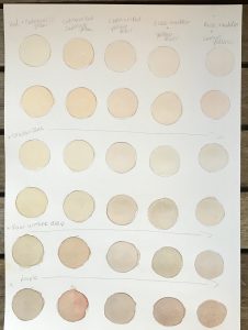
Here is a look at skin-tones I made with different combinations of red and yellow. I keep a test strip so I can see how my mix is turning out. You don’t want it too orangey.
I started by adding water to my mixing dish. Yes, it is literally a dish. You don’t always need a fancy pallet. Once I have have some brush fulls of water on the plate I add some color. I start with yellow. Then I add a little less red and mix it well. I add more water if I feel I have a color that is too orange. You can add more yellow or red depending on the tone you want. Let yourself have plenty of time to practice mixing watercolor skin tones.
The colors I used are in order:
- cadmium red and yellow ocher
- red and cadmium yellow
- rose madder and lemon yellow
- rose madder and yellow ocher
- cadmium red and cadmium yellow
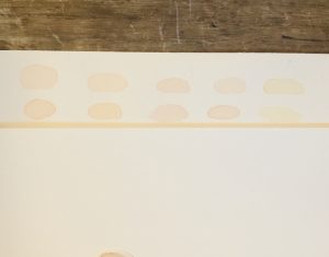
I use rose madder to give skin tones a more pinkish undertone.
I use yellow ocher to give the skin a cooler tone.
You can choose only cool reds and yellows to mix together or you can mix a cool and warm reds and yellows. I like to play around as much as possible.
How to tone down watercolor skin tones
Now, to tone down the orange and to make it darker you add blue. You only need to dab a small amount of blue. I you add too much you’re going to get green. However, adding the right amount of blue can help you get a nice olive skin tone. Here are the different tones from above with blue added to it.
To darken you just need to add a l add a little more red or yellow. It’s all a matter of play and testing to find the shades you need. To get a more medium tone you can also layer the paint. Layering helps add realism and dimension to your painting.
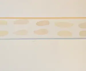
In the picture below you can see the contrast between skin tones mixed with and without blue. The top with the plus sign is has blue and the bottom doesn’t. The colors used to get these are:
- red+lemon yellow+ultramarine blue
- red+cadmium yellow+ultramarine blue
Mixing darker watercolor skin tones
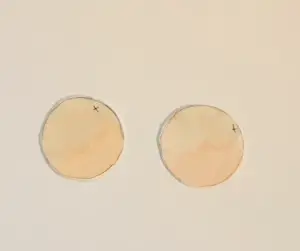
Now, let’s look at darker shades. I start with a red, yellow and blue and then I add some burnt umber slowly until I get the right tone. You don’t have to have a dark color that is super dark, remember, you can layer to achieve the look you want. You can also add a bit of dark purple depending on the tone you are trying to achieve. Here is a look at the above mixes with burnt umber added and then with purple added. Sometimes I also go and add either a little burnt Sienna or red. Dark skin tones can also have a pink or olive undertone to them as well. Do not be afraid of mixing dark watercolor skin tones.
I started by mixing my choice of red and yellow and then added some blue and raw umber. Sometimes I added a little more red or yellow depending on the tone. You can see some shades have a more pink tone while others a more olive tone. Get your paper out and start mixing and experiment.
The paint formulas for these are in order as follows:
- cadmium red + yellow ocher +ultramarine blue+raw umber deep+purple
- red + cadmium yellow+ultramarine blue+raw umber deep+purple
- rose madder + lemon yellow+ultramarine blue+raw umber deep+purple
- rose madder + yellow ocher+ultramarine blue+raw umber deep+purple
- cadmium red + cadmium yellow+ultramarine blue+raw umber deep+purple
Foundations
These colors are all just a foundation. You never should feel stuck with only using this type of process for creating skin-tones. It just keeps to know the foundations before you start experimenting with more whimsical looks.
Now, let’s talk about adding detail such as blush and shadow and highlight.
For highlights the best thing to do is to leave the part of the face you want to highlight ether unpainted or very lightly painted. If you’re working with a mixed media piece you can use white gel pens or Posca pens to add white. You can also use other colors to show highlight. We’ll discuss this more in the stylized skin-tone section.
When adding blush use the red you used to mix the skin-tone. This red with be very harmonious to the overall look. I add red in areas that get more blood. Those areas are generally around the cheek area nose and ears.
How much red and vibrant you apply that red will be based on of your going for realism or a whimsical look. To tone done the red for blush make the base skin and add more red instead of adding just straight red to your portrait.
You can break down the face to different zones. The top third generally more yellow, the middle section red, and the bottom section blue. Though, all areas so have some of the tones mixed in.
You can take this zone map and use it to add dimensions to your portraits. It’ll help you decided where to put cool highlights versus warm. You can also take this make and use it to paint whimsical skin-tones.
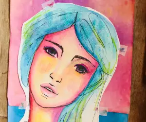
Painting Whimsical and Stylized Skin-tones
You can throw out making realistic skin-tones completely. Once you have a decent understanding of light and shadow you can let loose and create whimsical looks.
Whimsical watercolor skin tones
You can paint your face a base tone then use the colors of the zone map to paint the highlights and shadows.
Examples
Or, you can leave the face blank and only paint the areas that have blush or shadow.
Here I used a very pretty dark tone. Using red + cadmium yellow + ultramarine blue + and burnt umber.
I started the drawing using a pink watercolor pencil so when I added watercolor some of the pink would activate and mix with the brown. I used bright pink from Jane Davenports Bright watercolor set and a little purple. I used a realistic base for the skin and then used whimsical colors to add shadows to give the drawing for a stylized look.
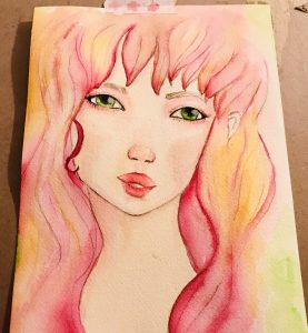
In this piece I started with a light yellow base. Not at all realistic. Then I added pink.
In this piece I used watercolor pencil in pink. I mixed in a peachy base and then used deep pinks and purples to detail the face.
Most of these faces are basically a base and then fun bright colors to accentuate the face to create a whimsical look.
You can choose colors that are not generally thought of for normal skin tones such as pink, purple, or blue.
This method is really easy in some ways because you only need to have the primary colors or at least about 3 colors that can be used for light and dark and blush.
The trick for really creating skin-tones and captivating faces is a play between light and dark colors. You can to use light colors to pull up areas of the face like the cheekbones and use darker colors to show depth and curves such as around the base of the forehead and around the eyes by the nose and to push back under the chin.

Did you find this tutorial helpful? Buy me a coffee and support my blog
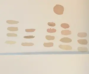
Here is a chart of the mixes I commonly use and love. I suggest that you pull out all your reds, yellows, blues, and umbers and start mixing and experimenting. Make charts and see what you love.
Watercolor Skin Tone Free Classes
If you are like me it helps to both read and see what you’re trying to learn. I highly, highly recommend Skillshare. Skillshare is an on-line streaming service for thousands of classes. There are a tons of art classes in every subject you can think of from drawing to painting.
I’m very addicted to Skillshare. There are things I didn’t even know I wanted to learn. You can get a FREE two week trial from this link. It will also take you to a preview of one of my all time favorite watercolor skin tone classes.

Free Skill Share trial!!! Click Here!!!

Leave a Reply